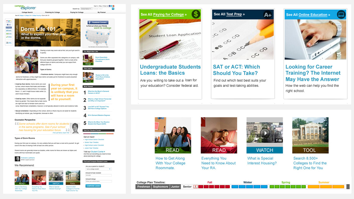
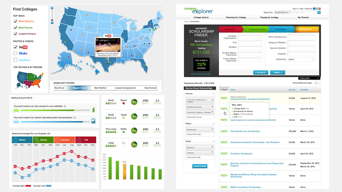
Please enable JS

CAMPUS EXPLORER

PROJECT DETAILS

SITE: CAMPUS EXPLORER

ROLE: ART & UX DIRECTION

Campus Explorer was primarily a lead gen site when I started, but the future vision was for it to become a content hub for all things college. The design of a new visual system had to appeal to both college applicants and their parents, as most modern parents are heavily involved in the college application process. The creation of personalized accounts allowed them to keep on track of their college preparations, searches, and obtaining financial assistance for their journey to higher education.


THE SOLUTION

Responsive Site

A Targeted Focus on Content

With the new mission, a shift to focus on content display became the priority. The content was individually targeted to be relevant for prospective students during the process of their college searches.

Mobile View

A mobile version of the site needed to be created to keep up with the increase in mobile traffic.

THE RESULT

POST LAUNCH

+230%
ARTICLE PAGE VISITS YR/YR
+35%
HOMEPAGE VISITS 6 MONTHS
+20%
REVENUE FROM TRAFFIC INCREASE

THE CHALLENGE & THE JOURNEY

about us

Overwhelming Links & Hidden Content

My analysis of the current Campus Explorer site revealed cognitive overload issues with the amount of links being displayed. The important content on pages were overshadowed by widgets and lacked clear hierarchy.

Generic Appearance & Poor Readability

The current visuals lacked a strong voice and appeared generic with imagery selections. The font sizes were small and had poor line-height proportions for reading articles and scanning links.

card sort

Brand Theme Development

I worked with my team of designers to ideate on what the theme, colors, and overall visual presentation of the site should be. Using map patterns, iconography, and other visuals, we were able to put together a theme based on the word "Explore". We also worked closely with the Managing Editor to align the copy and visuals.

Overhauled Color Palette

Knowing the site was going to be so content heavy with featured articles, timelines, charts, infographics and other information, I created a palette to color code data and also support levels of information while remaining cohesive. The color palette was informed by research I conducted on the most popular sites for the 18-24 demographic.

Style Guide

Themed Content Areas

Using the new color palette, content areas were color coded and a set of icons was developed to reflect each topic.

Stock Imagery

Due to the large number of articles, we had to continue to use stock photography for images, but we gave them character with color and pattern overlays.

about us

Font Sizing & Color

The font size and line heights were increased on all pages to improve readability and resulted in increased time spent on article pages. The use of color improved grouping of information and attracted attention to areas that needed it the most.

No Dead Ends

All content pages now clearly revealed related topics and the most popular articles in well-placed, more eye-catching ways, which resulted in an increase of page views.

about us

Information Graphics

Usability studies revealed that whenever information could be presented graphically, it was preferred. It was shown to be more easily digestible and increased the attention of younger users. It also made the amount of information we had for schools seem less intimidating and more fun.

More Tools

Many new tools were developed for the site, including a scholarship finder, school finder with a comparison feature, checklists and timelines. Competitor sites had some of these popular tools, and working with the product team we came up with many of our own. Visitors perceived these tools to add great value to the site.

about us

Sketching Ideas

Often we would sketch UI ideas for quick discussions within the design team, along with the product & development teams.

Top 5

We always worked to cut down on feature overload, as some of the tools had too many options. Research provided data on what information was most important to our audience.

about us

Mobile Site

When the redesign first kicked off, we lacked the resources the get everything done and make the site responsive. The new site was designed with a bootstrap grid to make it easier to move to a responsive version when we were able to do so. In the meantime, a mobile version of the site needed to be developed. I worked out the architecture of the most important pages and wireframed them out.

UX Testing

As time went on and we had the resources, I hired UX designers to work on the account pages and create wireframe flows, which we put into InVision for testing and refinement. Next, we tested high-fidelity versions once we finished iterating and testing the wireframes.

about us

The Task Question

What percent of the population is male vs. female at UCLA? The testers aged 45+ all found it by looking under "demographics". The testers aged under 22, couldn't find it, and ALL of them were looking for it under "social life".

The Big Reveal

When the tasks were completed, we asked "Why did you look under social life?" Their answer: "Because that's who my friends would be." This was a great discovery that opened our eyes to the different places parents vs their children might look to find information. As a result, we worked on a solution to have the information in both places without creating duplicate content.

MORE PROJECTS