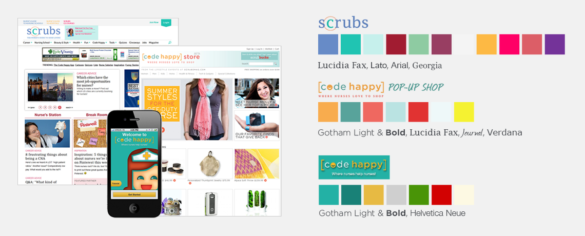
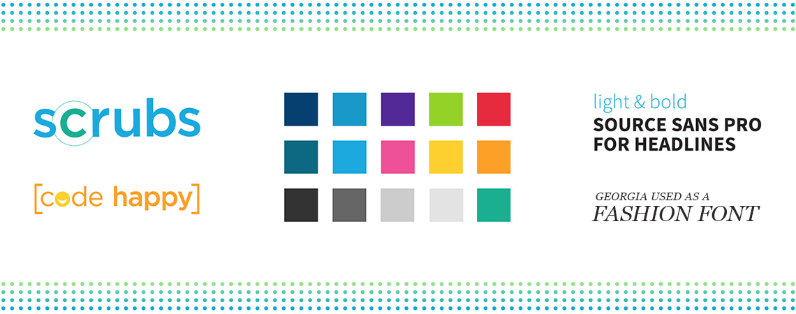
Please enable JS

SCRUBS

PROJECT DETAILS

CLIENT: SCRUBS MAGAZINE ONLINE / Mind Over Media

ROLE: CREATIVE & UX DIRECTION

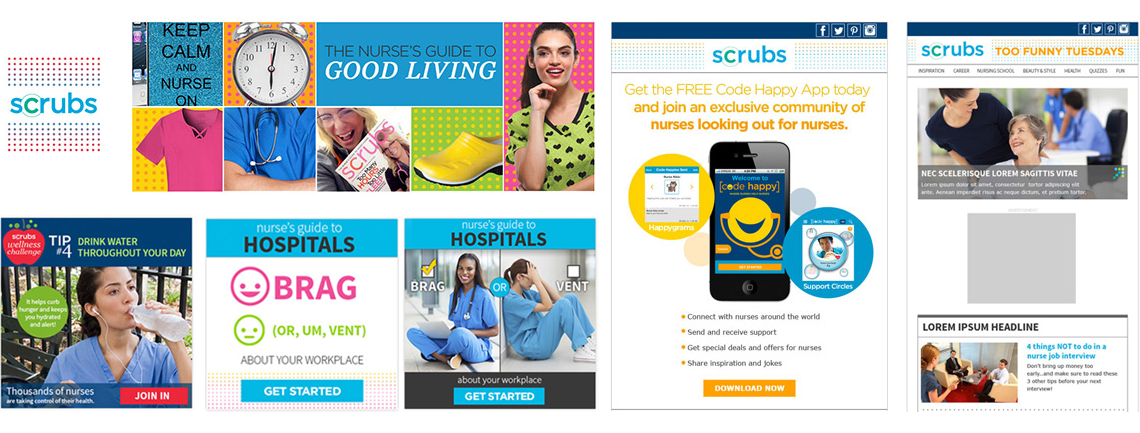
Scrubs is a nursing lifestyle & content site with a heavy focus on job humor & workplace fashion. It also features serious career articles & information on nursing schools. As part of the Scrubs ecosystem, there was also a short-lived shopping site called "Code Happy" that featured gifts for nurses. Lastly, there was an app for nurses to send support to each other, which was also called Code Happy.


THE SOLUTION

Responsive Site

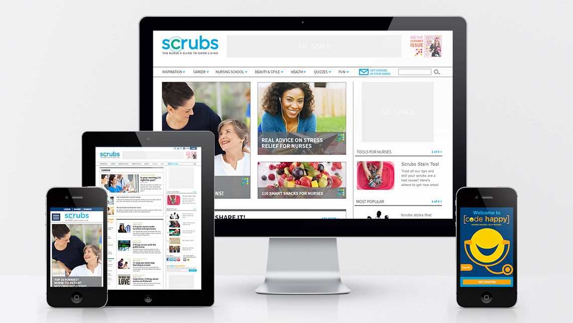
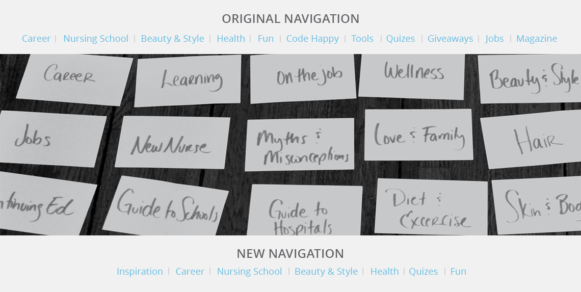
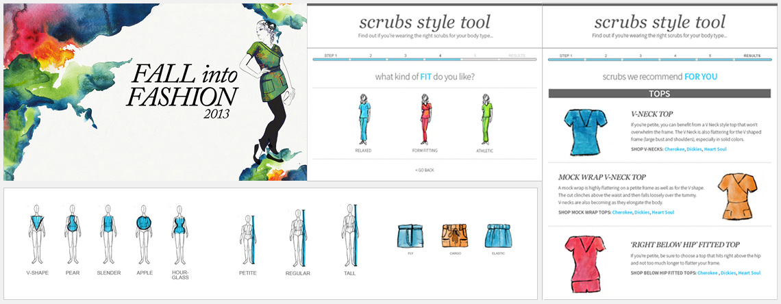
Responsive Site Design

After restructuring the IA, the site content was color coded and put into a responsive layout so it could be easily viewed on phones or tablets, which were the top devices being used to access the site according to analytics.

Code Happy Reskin

The Code Happy App had been previously built, and while it did have many UX issues, the budget only allowed for a reskin to match the new style guide, and a few adjustments to the improve the UX.

THE RESULT

FIRST MONTH AFTER LAUNCH

+10%
RETURN VISITS
+9.6%
PAGE VIEWS PER VISIT
+9.64%
AVERAGE TIME SPENT ON SITE

FIRST YEAR AFTER LAUNCH

+108%
UNIQUE SITE VISITS
+100%
SOCIAL MEDIA AUDIENCE
+40K
SOCIAL ENGAGEMENT PER MONTH

THE CHALLENGE & THE JOURNEY

about us

Lack of a Style Guide

My analysis of the current Scrubs sites and app revealed color palette, imagery, and font inconsistencies.

Inconsistent Tone & Presentation

Photos, illustrations and iconography were inconsistent across the properties and lessened the strength of the overall brand.

card sort

Vague Categories

The most significant finding was that hardly anyone clicked on the "Code Happy" menu option. Users also often clicked from one nav option to another, without interacting with the pages, suggesting they weren't finding the content they expected to be there.

Overall Restructuring Necessary

Open and closed card sorting confirmed that "Code Happy" was too ambiguous, as no one knew what to place under it in the closed sort. Other opportunities to improve the IA became apparent, especially with "Career" and "Jobs" (there was no job board, so this was confusing), and "Tools" which was too vague.

Style Guide

Listening & Empathy

The current logo colors were often pink, orange, or purple, as they were perceived as "fun" colors, and this was a color trend that I was asked to continue. However, through social listening, I discovered many nurses felt they were not as respected as doctors. Also, reports on the future of the nursing profession revealed that more men had been entering the field of nursing and that trend was expected to continue.

Logo Redesign

As a result, I decided the logo should be blue - a professional color. I also added a navy blue color to the new style guide for use in more professionally-focused areas. The previous logo was designed with the Lucidia Fax font, which was originally created for telefaxing, so it was not an ideal choice. I reworked the logo with the Gotham font, which was already being used in parts of Code Happy. "Gotham inherited an honest tone that’s assertive but never imposing, friendly but never folksy, confident but never aloof." - Typography.com

Style Guide

Color Palette

The original Scrubs colors were muted and seemed to come from outdated uniform colors. More modern scrubs had begun to move away from those colors, as most people associate them with illness. So, I brightened the color palette by analyzing popular lifestyle sites and magazines (outside of the medical profession) and followed suit, which allowed the broader range to support the "fun" tone when it made sense for it to come into play.

Style Guide

I developed a full style guide with the new logos, colors, fonts, decorative elements and photography guidelines. We moved away from the silly stock photo images that were previously being used and focused on more polished looking lifestyle photos.

about us

Social Media

All social media assets needed to be overhauled to match the new look and feel.

Online Marketing

Emails, newsletters, and ads had to be redesigned to match the new look as well.

about us

Scrubs Fashion

A big part of Scrubs content focused on workplace fashion, as the site is owned By SPI, and therefore presented opportunities to feature new styles for Cherokee, Dickies and Heart Soul each season.

Style Tool

I redesigned the style tool with a better user flow and created the illustrations for it as well. Nurses could then save their style profiles that best fit their body types and personal preferences. This was a great way for them to get fashion advice while promoting the latest in scrub styles.

MORE PROJECTS