Please enable JS

DATAPOP

PROJECT DETAILS

CLIENT:DATAPOP

ROLE: VISUAL & UX PRODUCT DIRECTION

DataPop had engineered an impressive new big data analytics and ad management product for businesses. Their talented team had created an amazing tool, and they needed a graphic / user experience designer to come in and create an interface that would be friendly to online eCommerce marketers.


THE SOLUTION

Responsive Site

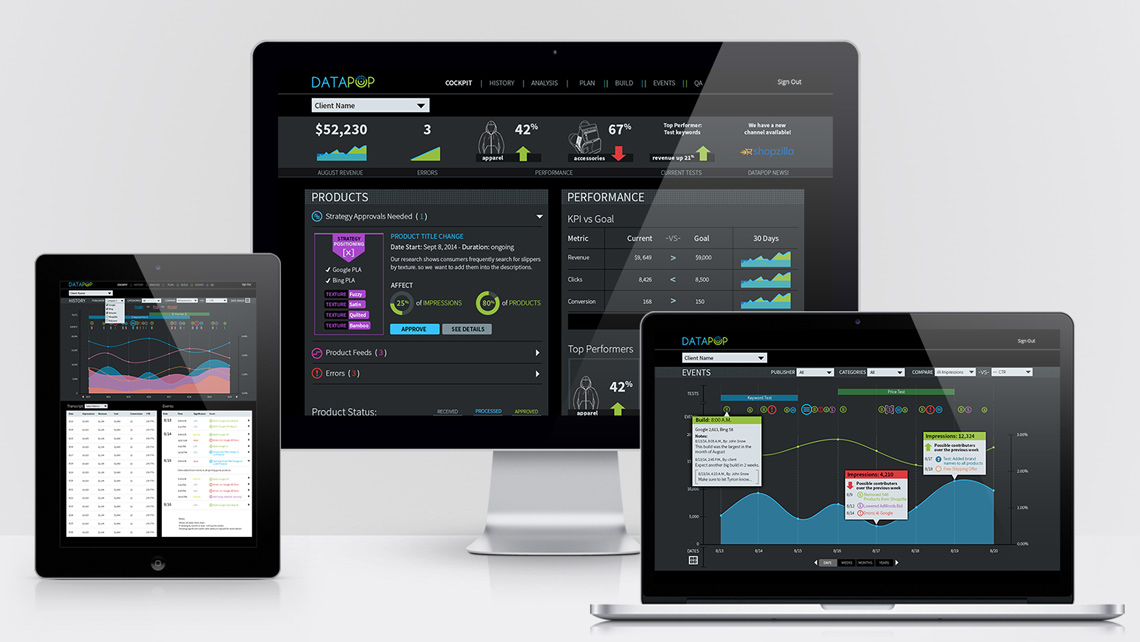
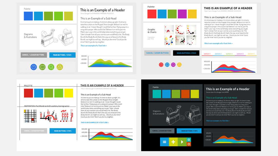
Creation of a New Style

DataPop had a look and feel they previously established before the new OmniAds™ product was created (mostly for their website and marketing materials). In the initial ideation phase, I explored refining that style and conceptualized other potential new looks. Once the direction was decided upon, I created the style guide.

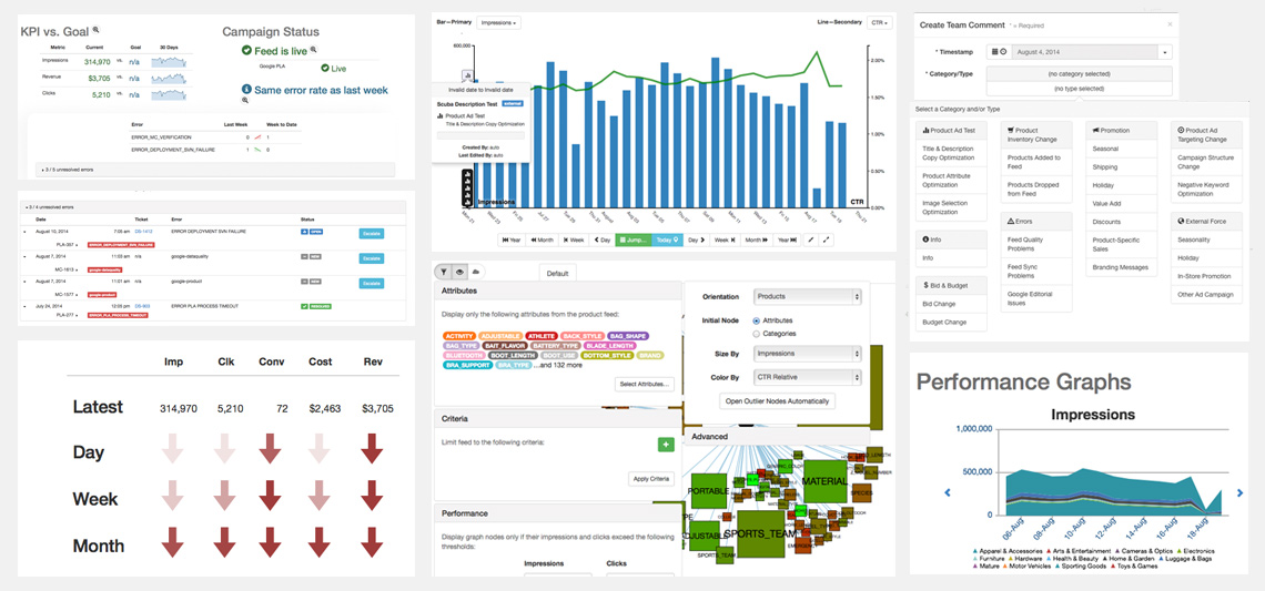
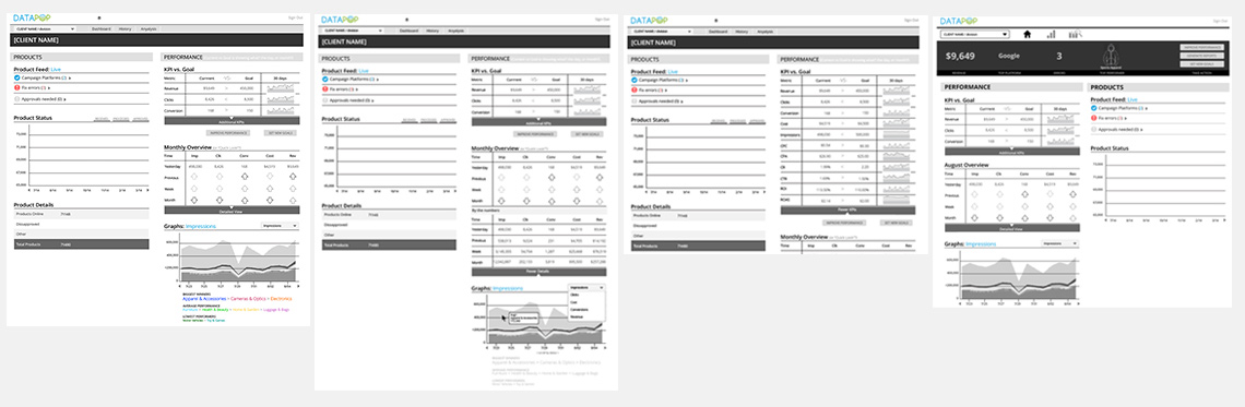
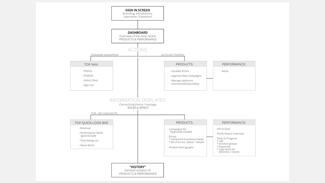
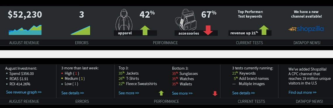
HUD, Hierarchy & Features

They had data sets and some features already settled on, but they didn't have the hierarchy worked out. I thought a campaign summary section at the top of the dashboard would be helpful to surface the most important issues. I also worked closely with them to build new features to solve various challenges that arose along the way.

THE RESULT

4 MONTHS AFTER LAUNCH

:)
CURRENT CUSTOMERS WERE HAPPY
:O
THEY GAINED BIG ACCOUNTS
!
CRITEO AQUIRED THEM

THE CHALLENGE & THE JOURNEY

about us

Parts Without a Whole

They had a lot of the technology and data working, but as you can see, it had no cohesive style. It also used technical language that wouldn't be easily understood by the target audience. The UI was extremely confusing with many overlapping windows.

Clock Ticking & Teamwork

The launch date was already set and we had 3 months to pull everything together. I was the only UX / Designer on the project, so their team of engineers, data scientists, programmers, and I sat in a room together and worked it out.

card sort

Quick Style Boards

Since so much work had to be done on the product interface, a general style direction needed to be quickly agreed upon and adjusted as we went along. I put together several mood boards after hearing what the founders wanted the vision to be. In the discussion I said, "Well, what if it had a black background?". That idea didn't sell right away, so I mainly focused on white backgrounds.

A Direction Was Chosen

After the client saw the mood board with the black background, that direction was chosen. It was a bold choice and I commend them for it. I think it went well with the name "DataPop" since the data would certainly "pop". I didn't realize until much later that this style would result in me having to do A LOT of drawings. Good thing I like drawing!

Style Guide

Basic Wireframes

I took the basic information components they developed and started organizing them into a page. I based the design on a bootstrap grid and created two columns - one focusing on specific product statuses and campaigns called "PRODUCTS" and the other for "PERFORMANCE" which reflected overall performance and categories.

Introducing the HUD

Having worked a for a long time in online marketing, I knew that a quick snapshot of the monthly revenue, product performances, and other key information would keep them coming back to the dashboard and have easily accessible actions to improve campaigns.

Style Guide

Established Clients User Flow

I worked with product to quickly sketch out the initial user flow of the crucial data display pages and interaction pages that had to be completed by the launch date.

Only a Starting Point

As the project progressed, we were moving quickly with close communication, so updating the user flow chart wasn't necessary.

Style Guide

HUD Default View

We discussed what would be the most important information for marketers to see. Errors were an important part of this product, because the resolution of errors fixed campaigns and increased revenue. Monthly revenue was key, and knowing which products were performing the best and the worst would allow marketers to make quick decisions to improve their metrics. Tests were run regularly to optimize campaigns, so this was also very important information to highlight.

Hud Hover / Tap

More robust details were behind each item, and a link to take them deeper into analytics gave them a quick path to the most important information.

Style Guide

Terminology

While working on the look of the UI, I also started to address some of inconsistencies the more technical language that was being used. I started a terminology document that we could work on together to make sure we were using friendly, consistent language.

Language Is Experience

Beyond how a product or service works and looks, navigation terms, CTA's, descriptors and copy are also key components of experience design that is often overlooked.

Style Guide

Icons

On graph views, events along a timeline were shown as icons for a quick view. Details for each event are available below, but the size of the icon displayed would indicate the impact of the event (larger = greater impact).

Category Illustrations

On the dashboard, categories were displayed with illustrations and text. I had to create over 40 drawings to represent the top-level categories, which did result in a cool look. However, for a long-term product scale, a different approach would likely be a better solution.

Style Guide

Pitch Decks

With the product designed and being built by the programming team, there was still some time to work on pitch decks. It was a complex technology that needed to be explained in a way that a non-technical audience could understand.

Not Just A Red Dress

I came up with a concept showing that a product, such as a red dress, which might be displayed in an ad, was not just any dress. It had a wealth of information behind exactly which red dress was being shown and to whom. The decks were structured with a story of a red dress, following the technology behind it, and how something as seemingly obvious as a red dress turned out to be not-so-obvious, and was in fact highly-targeted.

MORE PROJECTS